Nov 1, 2019
Project Report: Generating Fake Book Pages Using a GAN
-
table of contents
- Background
- So Why Pages?
- Which Implementation?
- Interesting Results
- A Note on Computing Resources
- Art Decider: Not Art
Two images of book pages that were created by a generative adversarial network (GAN).
Background
In January of 2018, I got the flu. Among other horrible symptoms, I had totally lost my ability to sleep for more than 2 hours. I needed a way to fill my time, and take my mind off the muscle aches and the chicken noodle soup I couldn’t taste. Because it’s very important to never do paid work on sick time, so I started fishing around for machine learning projects totally unrelated to medical imaging. My search for distraction led me to try and re-implement a version of the progressively growing generative adversarial network (PGGAN) by Karras et al.
What is a progressively growing GAN? Back in the day (okay, 2017), it was difficult to synthesize high-resolution images using generative adversarial networks (GANs). At resolutions higher than, say, 128x128 pixels, GANs were unable to capture the union between macro structures and fine details that characterize real images. People had tried, for example, to synthesize images of people’s faces at high resolution (1024x1024), but the results were just flat, untextured expanses of skin with eyes and mouths awkwardly smushed in. To make matters worse, training GANs with the method previously available with computationally expensive, making training high-resolution GANs out of the reach of all but the most well-resourced labs.
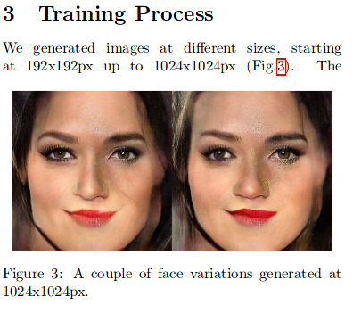
Figure 3, "Megapixel Size Image Creation using Generative Adversarial Networks," Marco Marchesi.
Karras et al.'s "progressive growing" method surmounted these difficulties. Their innovation was that they would train networks in pieces, starting with a low resolution image synthesis network, and moving to a high resolution image synthesis network. The previous resolution would be used as initialization for the subsequent, higher resolution, which means that the network isn't starting from scratch at each resolution. So, by training a 4x4 image generator, you're on your way to creating an 8x8 image generator, and then a 16x16, and so on and so forth until you get to 2048x2048, or even larger.
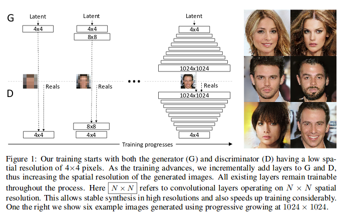
Figure 1, "Progressive Growing of GANs for Improved Quality, Stability, and Variation," Karras et al.
The results were very impressive. The authors generated high-resolution images far more realistic than achieved by any previous GAN architectures, trained with much higher computational efficiency. The progressive growing method shown in this paper was quickly mimicked by others, and today it has become a commonplace tool in newer works, mixed and matched with other GAN-training methods. It also spurred the latent space interpolation craze on Twitter (ramen!), which we would see popping up again after BigGAN was published (monkeys!!).
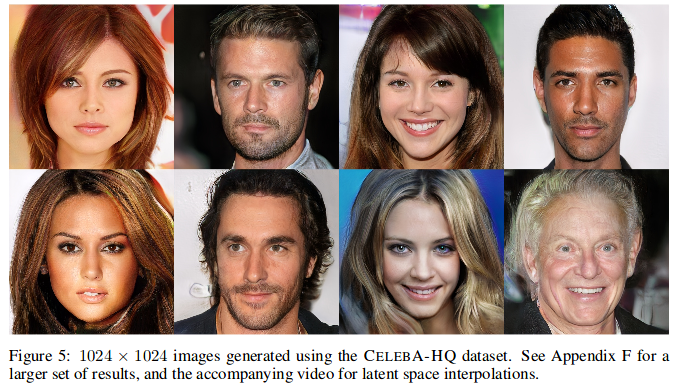
Figure 5, "Progressive Growing of GANs for Improved Quality, Stability, and Variation," Karras et al.
So Why Pages?
I was a print designer in undergrad, and study the news now, so I've spent a lot of time looking at newspapers. Most pages have repetitive elements, and the work of design is partly to make decisions about where to place these elements relative to each other. Some examples of these elements are headlines, paragraphs, page numbers, images, captions, and footnotes. If you were to look at a newspaper every day for months, you would see some of these design elements move around, but mostly they would obey certain rules of design dictated by common conventions and aesthetics. I wanted to see if a GAN could replicate basic print design principles when trained on a dataset of pages that contained many or all of these elements.
Example of all the design elements that go into a page. Headlines, text, masthead, images, more! From tweet.
So, the first question was: which dataset of pages to use? After some searching, I found that the Internet Archive had loads of scanned pages of both newspapers and other publications available online, and a nifty Python API that you can use to download them. Some of the Internet Archive's datasets were likely too small to train an effective GAN (less than 1000 pages). Others seemed too varied from page to page to learn an effective distribution without some form of mode collapse (a term for when a GAN only learns an often repetitive subset of the true distribution of images). Still other datasets were just too basic to be interesting, such as novels that contained uninterrupted blocks of text for hundreds of pages at a time.
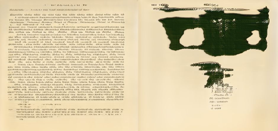
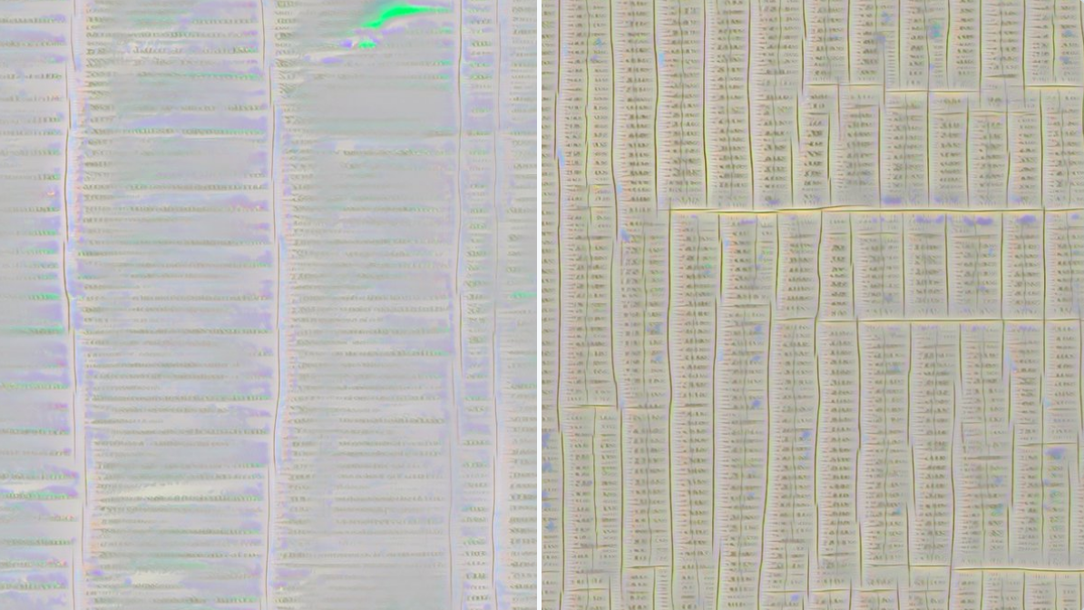
I end up using a dataset of pages from the archived research works of the Marine Biological Library (MBL) and the Woods Hole Oceanographic Institute (WHOI). These pages had charts, headers, page numbers, images, and varied stylistic choices from report to report, but still followed a basic, uniform design structure. I have also spent quite a bit of time in WHOI myself visiting some researcher friends there, so the choice was slightly sentimental :).
An example of a page from the MBL-WHOI collection.
Which Implementation?
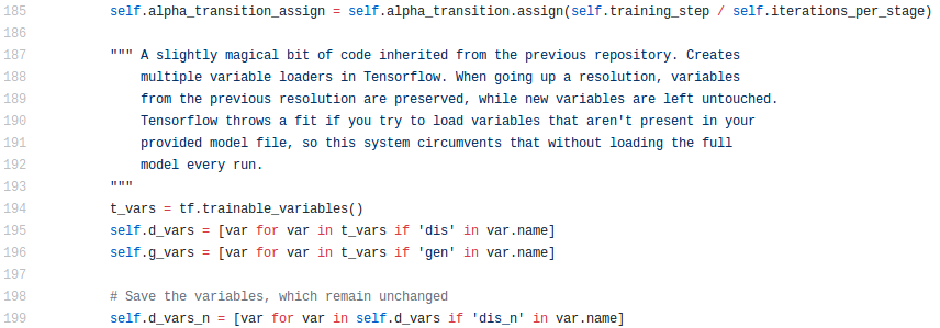
It was early days for the PGGAN when I worked on this project. Unlike today, Github did not contain endless functioning reimplementations of Karras et al.'s code, so it seemed like I might have had to use the original. This will make you feel old, but Karras' original code was written in Theano, which I had not yet used and had no intention of trying to figure out. I was saved by Jichao Zhang, a student at Shandong University working on GANs. He had mocked up a version in TensorFlow, which I forked.
Zhang's implementation was complicated. I have long held that people who code in TensorFlow for long enough (e.g. me) develop an irreversible brain-sickness that permanently and negatively affects the way they architect both their code and their thoughts (but hey, maybe TensorFlow 2 will solve that!). For example, in Zhang's implementation, you had to instantiate the entire PGGAN at full-size at each training level, explicitly select the reduced portion of weights you wanted to train for that resolution of the GAN, and then craft de novo cost functions at each image resolution. This non-intuitive training method, compared with the even spookier looking code required to implement it, was probably one of the bigger barriers to sharing my GAN work with my colleagues down the line. Lesson learned! Rearchitect your code if you want to share it with people.
Everyone knows that good code requires regular 6-line block comments to be intelligible to its users.
Interesting Results
The most interesting result is that it worked! After a week or so rooting out bugs, I was able to generate high-resolution pages filled with pseudo-letters, columns of text, fake page numbers, and psychedelic illustrations. Here are the big takeaways.
Page Layouts
A one-column layout and an image/chart layout. Notably, I resized rectangular pages to square, so all of the pages generated seem a little compressed.
We can start with the macro page design. DeepZine was very good at creating a variety of page layouts, with one or two columns, ghostly half-charts, interspersed headers, page numbers (!), and full-page ink splotch illustrations. Interpolating between two points in the latent space shows how some of the latent variables control things like margins, line spacing, and the size of the charts and images. Everyone gets angry when you compare deep learning algorithms to people, but the way it constantly resizes text and images to fit new designs very much reminded me of myself, testing print layouts during work nights at the magazine.
Synthetic Language
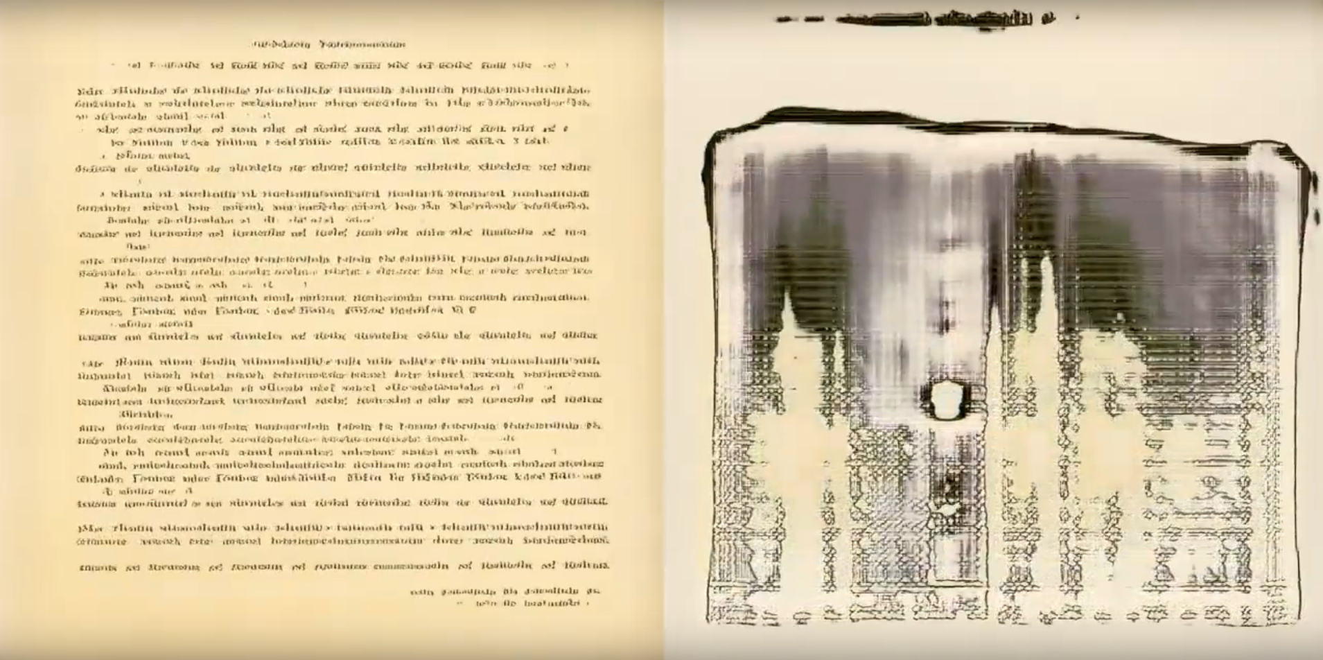
Example of synthetic text generated by DeepZine
Most people find DeepZine’s synthetic language to be its most interesting result. Pages generated by the GAN have curly, Elvish-like script that morphs as you advance through the latent space. It's an amazingly convincing solution to what I thought would be the GANs main weakness: its inability to reproduce text with any detail or, of course, meaning. I had envisioned thick, wavy black lines drawn on a page; what I got was a series of "words" of different length with varied letter structure that, when you squint, were imperceptibly different from some real languages' written scripts.
Those in the machine learning community have seen many iterations of this fake language phenomenon before and since DeepZine came about, especially in those GANs that generate cat memes. I've seen a more interesting variant when working on medical images, specifically during my attempt to re-apply the same PGGAN process to retinal fundus photographs. In those cases, retinal images had imprinted patient notes in the bottom-right corner of every image in the exact same location, often with some of the same words. In this case, the GAN would generate precise English words in the bottom right corners, indistinguishable from the real text annotations, and abruptly flip between words as one traversed the latent space. It thus seems that there may be a trade-off between realism of text and the number and position of unique words in the training dataset.
Ink Blot Illustrations

There were even weirder ones than this, I promise! I'm just too lazy to find them right now :)
So what’s up with those weird inky illustrations? To me, the crude, blotchy images illustrate the dynamic trade-offs that the generator and discriminator make during training. The original dataset of pages is biased towards text and table images, with fewer illustrations. Because there are fewer illustrations, the discriminator cannot distinguish between real and fake images as well, and the generator does not need to work as hard to create them.
I also find it interesting that DeepZine creates any images at all. I would have expected mode collapse, where the larger number of text pages promised that every page would have text, but apparently not! Credit again to the PGGAN creators.
Latent Space Interpolations
If you figure out a good way to answer "what am I looking at" when you show someone this GIF, send me a message.
The most visually-compelling outputs from DeepZine are its latent space interpolations, in which pages continuously morph from one design to another. I have always wanted to know more about the structure of latent spaces in GANs. Here are two questions I had about latent spaces, likely familiar to those who have spent time playing with GANs.
The first question: how many unique pages are there in the whole GAN? It is likely a finite number, as pages stop changing if you push their latent codes into magnitudes outside of the training latent distribution (e.g. [100, 100, 100, ..., 100]). Different "rates of change" in images as one performs latent space interpolations implies that different pockets of latent space are likely not equally sized. This means that calculating the number of unique pages via some proportion to the size of the overall training space will probably not work. This all makes me wonder: could the latent space of a GAN be constrained to create different numbers of images in its space, or images whose corresponding section of latent space was differently sized or shaped? Hopefully someone will figure that out sooner or later.

A page found near the origin of the latent space. It is spooky to me how it is essentially a "zero" page.
The second question: do certain parts of latent space create similar representations across all GANs? One fascinating aspect of the latent space that has emerged in all my training runs of DeepZine is that the latent code at the origin [0, 0, 0, ..., 0] corresponds to a blank page. Weird! It felt like a union between human understandings of zero (empty, nothing) and what should be an unrelated conception of zero by the GAN in latent space. I have found this in other GANs too, where the image generated by the origin is often devoid of content in a very "zero" kind of way. This pattern might imply that image phenotypes in latent space really are conditioned on mechanisms similar to sliders, where the further you get from zero, the more extreme a certain feature is. As always in machine learning, other people are on the case. Check this Github issues thread for a good example.
Filter Visualizations
Two images generated by maximizing the activations of two separate convolutions in DeepZine.
Many people in the deep learning community have seen convolutional filter visualizations before. To create a filter visualization, one can take a randomly-initialized, white noise image, and iteratively alter it such that it maximizes the value of a downstream filter in a pre-trained neural network. If all works well, this process will create a qualitative visualization of what features that filter is "selecting" for, if that is indeed what the filter is doing. Particularly marvelous examples of this have been shown in a Distill article on feature visualization, and in a package subsequently developed by Google. Usually, feature visualizations are applied to classification networks, showing how one filter might focus in on, say, a cat's ear for classifying pictures of a cat.
Using some code ripped from the Lucid toolkit, I applied the feature visualization method to convolutional filters in the discriminator of DeepZine. As far as I know, feature visualization had not been publicly applied to GANs before this, so it was exciting! By visualizing layers at further levels of abstraction in the discriminator, one could see repetitive structural elements in the pages emerge: columns, lines, charts, etc. Check out the image above!
I still don't know what I'm really supposed to take away from feature visualizations, particularly in the discriminator of a GAN. The visualizations show that something is going on, but for me, do not provoke follow-up questions. Would be very interested if it did for someone else!
A Note on Computing Resources
After I put DeepZine on Twitter, I got an interesting message from Robbie Barat, an artist that uses deep learning methods, about how I was able to train DeepZine without access to huge amounts of GPU resources. According to the paper, he told me, training results akin to NVIDIA's original results would take 1-2 weeks on the most expensive NVIDIA GPU available at the time.
In reality, I was able to train DeepZine in probably 1.5-2 days, on an NVIDIA GPU with less memory than those recommended by the NVIDIA team. I can think of a few explanations for why.
The most obvious explanation is that I constructed my PGGAN to use fewer filters. In DeepZine, as opposed to the original PGGAN, I had throttled the filter number and batch size at higher resolutions to fit on the GPU card I had available. At the final resolution (1024x1024), I was using a batch size of 4 and only 16 convolutional filters. With that few filters, it could be that the filters in the higher resolutions are acting more similarly to deep learning upsampling algorithms that just reduce aliasing effects, rather than genuine GANs that create de novo fine-level details. This could even be the explanation for why the generated text isn't strictly English letters. This is all to say that I almost certainly did not achieve the quality of the original PGGAN work in my own work, and I had trained with NVIDIA's methods, I probably would have had even more interesting results.
A more sinister viewpoint is that NVIDIA (and all big industry labs) intentionally uses as much GPU power as possible in their public works on the most expensive GPUs they currently offer, regardless of output quality, so that people will be pressured to buy more GPUs. Wouldn't fault em'! But probably not the whole case.
Art Decider: Not Art
Many of my friends, especially outside of machine learning, imply one way or another that creations like these are a form of digital art or even "AI art." I admit, I also describe it this way sometimes as an easy entrypoint to the project. But I have never thought of this project, or similar projects that I work on, in this way.
I work on projects like these as neat objects that help me answer questions I have about machine learning, or other things. I found pages to be a good, limited example of what GANs could do that would be easier to grapple with than, say, human faces. The interesting visualizations also provoke new questions for me to explore in future projects. Other people online have different motivations for using GANs to create visualizations, particularly Helena Sarin, Joanna Hastie, and Robbie Barat, and if you're interested in AI art, I suggest that you follow them!
Oct 20, 2018
Takeaways From the Russian Ad Explorer
-
table of contents
- Background, Design, and Motivation
- Not Just Conservatives, Because Progressives Get Clicks
- The Data We Don't Have
- Memes — Not Even Political Memes, Just Memes
- Vote for Bernie, or Jill Stein
- Post-Election Goals of the IRA
- Self-Defense Classes, and Other Events
- Not Just Americans
- "Sowing Division"
- What's Next
Background, Design, and Motivation
On May 10, 2018, Democrats on the United States House Intelligence Committee released 3500+ Facebook and Instagram ads created by the Internet Research Agency (IRA) between 2015 and 2017. The IRA is believed to have created these ads to influence the outcome of the 2016 United States presidential election, and in general influence Americans' political views.
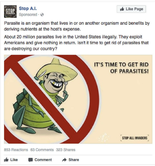
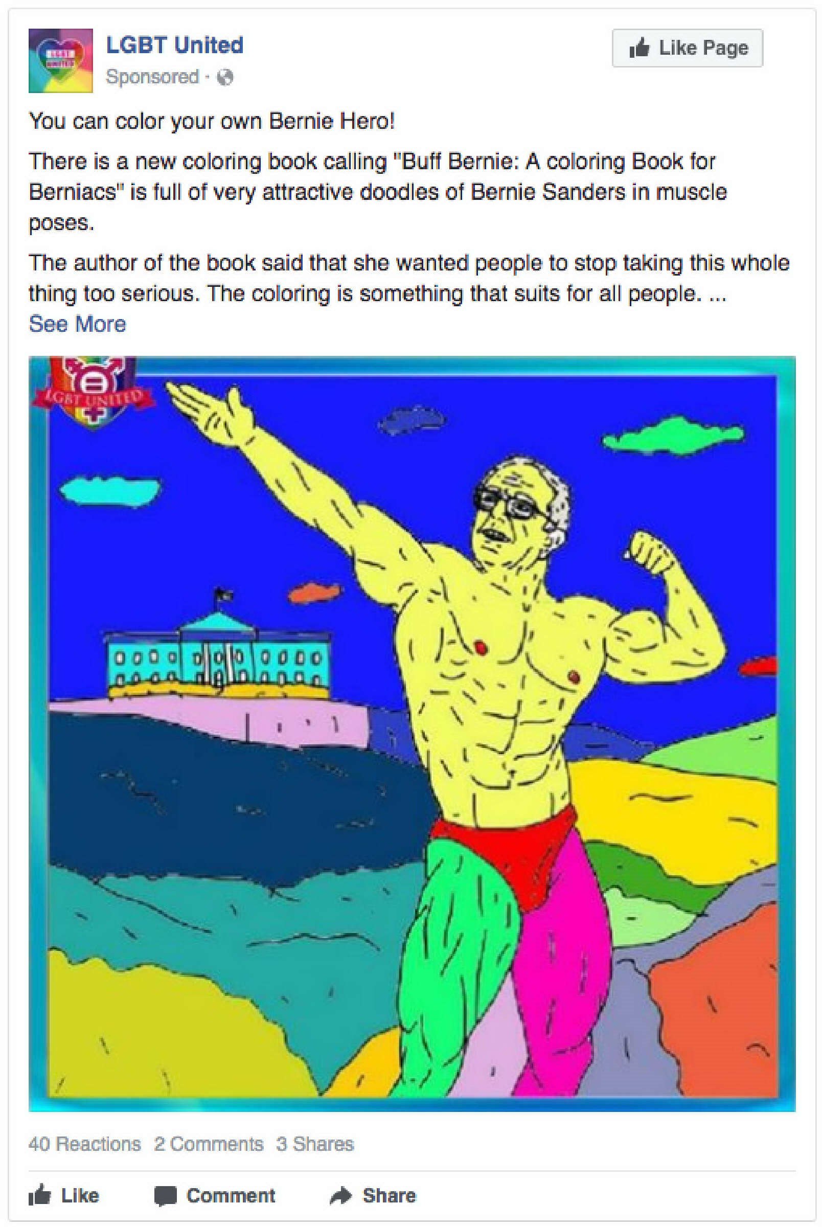
Probably the worst advertisement from the IRA dataset.
I first read articles about this dataset the day after it was released, and I was intrigued. The story was straight-forwardly interesting. To me, the ads featured on sites like Wired and the Washington Post were a look into how non-Americans perceived America. The ads featured in these news reports were direct appeals to wildly different sectors of the American populace — conservative, liberal, LGBTQ, gun-owners, Native Americans, incarcerated — and had a bluntness in their messaging that other American political ads I saw lacked.
I thought of the ad release as a great sociological dataset — published results from an unethical experiment designed to maximize American advertising response. This dataset helped to answer questions like "what ideas, in our present political environment, drive different groups of Americans to share ideas with their peers?". While limited, it could also answer questions like, "to what extent, if any, did these ads result in concrete changes to American's political views, or the American political system?". I am sure there are dozens of other questions this dataset could answer that would not have even occurred to me.
Unfortunately for anyone interested in answering these questions, the US House Intelligence Committee and/or Facebook made the data about as difficult to analyze as possible. Each ad was contained in an individual PDF file with unorganized images, free text, and sometimes incomplete or absent metadata. While I did not (and do not) have the time to actually study these ads full-time, I felt bad that the people who did would have to waste their time cleaning up this data. I make terribly messy datasets usable for a living these days, so I thought that maybe I could do this data preparation work, and then make that data public for others who had the inclination to dive deeper. I also strongly believe that interactive and "fun" visualizations can make trends in data pop out to users, so I wanted to try and stretch some of my web development skills on a data explorer for the ads.
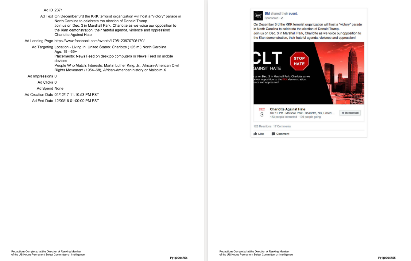
Example PDF released by Congress for the IRA ad dataset.
After a month or so of nights after work, the result was the Russian Ad Explorer, and the accompanying Russian Ads dataset hosted on Github. The dataset contains the images extracted into .png files, and text/metadata extracted into JSON format and .csv files. Additionally, because the provided audience tags were for the most part hyper-specific and non-overlapping, I editorialized and hand-labeled audience tags like "Incarcerated", "Latinx", and "Above Age 30" (this process is definitely subject to error). I then made a data explorer in d3.js and a few other Javascript libraries based on this data, so that others could easily page through the data and get a sense of its significance.
The experience ended up being a fun, and in my view, pretty successful project. Probably the hardest part was writing this blog post. I originally wanted to make the post that was a grand analysis of the dataset — where I would tell you all what it all really meant. But mostly, I have no idea. This dataset is a small piece or a starting point in what certainly must be a much larger project. This project would really dig in to what the aims were of the IRA, to what extent their were successful, and what their successes can tell us about political communication in the sphere of social media. Hopefully, some other people see this project, and feel motivated to research further (at least one person has!). If one of those people is you, send me a message!
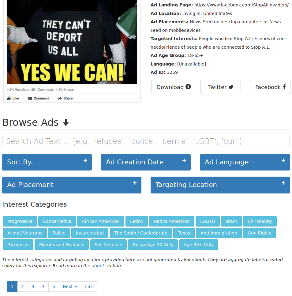
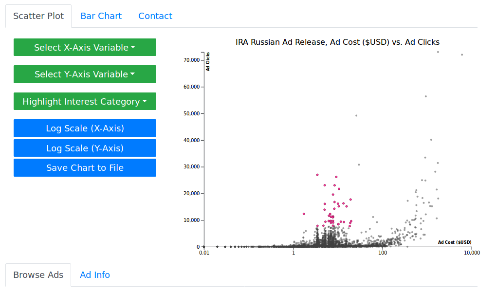
A screenshot from the Russian Ad Explorer
All that aside though, I didn't want to leave you with nothing. It's hard to pour over a dataset for a month and not have a few takeaways. Check below for a few of my biggest ones, listed in bullet-point format.
Not Just Conservatives, Because Progressive Get Clicks
When news first hit of Russians using Facebook and Instagram ads to politically influence Americans, many people that I talked to assumed that they would be targeting the stereotypical conservative voter: an older internet novice that is easily swept up by conspiratorial thinking. Even when evidence of IRA ads clearly appealing to black voters were published, at least some assumed that these ads must have been shown to conservative white voters, in order to make them feel reactionary anger towards the concerns of Black voters.
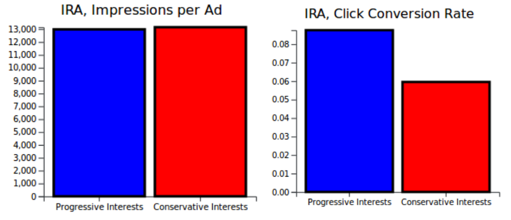
Both of these viewpoints are incorrect in the IRA data release. Only 18% of the ads appealed towards viewers with what I labeled as obviously conservative interests (Gun Rights, Police, Patriotism, Anti-Immigrant, Christianity, Army, Texas, The South, Conservative), compared to 64% of ads targeted towards obviously progressive interests (Progressive, African American, Islam, Prison, Native American, Latinx, LGBTQ+). Furthermore, ads aimed towards conservatives performed worse in average number of clicks per ad (959 vs 1,290 clicks), despite the IRA paying more money for conservative ads ($51 vs $21). Digging deeper, we can see that even though Progressive and Conservative ads were, on average, shown to the same amount of people (~13,000 for both), the percentage of people who clicked after viewing was higher for Progressive ads (9% vs. 6%).
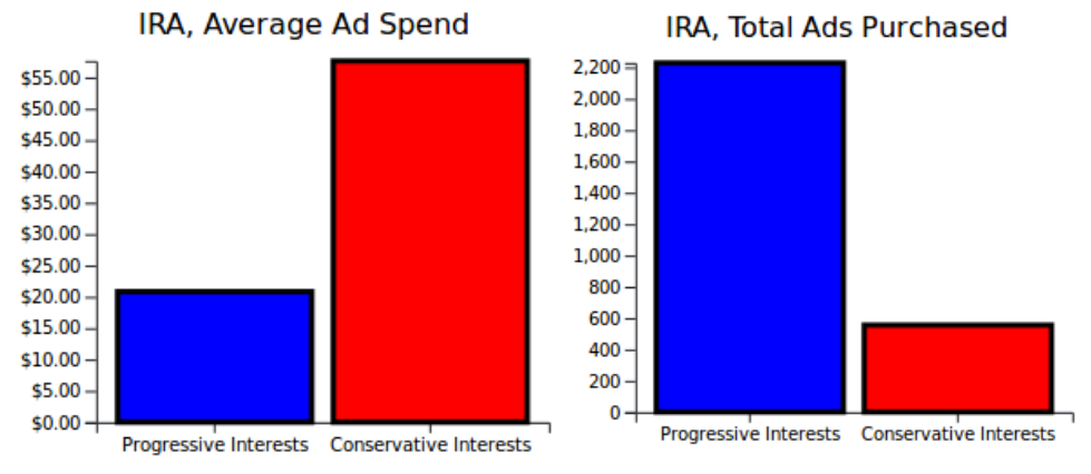
The IRA purchased many more ads aimed at progressives, but paid more for the ads they aimed at conservatives.
There is some reason to be skeptical of these statistics. As described earlier, I base my analysis on qualitative "interest categories" that I personally have determined. The IRA's original interest targets numbered in the hundreds, and were not specific enough to facilitate this kind of analysis. In a process detailed in the about page of the Explorer, I aggregrated them into broader categories, but mistakes could have been made. The more important reason to think harder about these statistics is that the distribution of ad clicks, impressions, and cost is more exponential than normal. A few extremely successful, or extremely expensive ads, could have skewed those numbers either way. But, this is at least a start ¯\_(ツ)_/¯.
Progressive ads were better at converting ad viewers ("impressions") into user interactions ("clicks").
As far as I can tell with the data explorer, there were no ads highlighting black empowerment aimed towards conservative voters. The IRA targeted all sides of the political spectrum, and some of the most creative ads come from campaigns aimed towards Black people and queer people [link, link].
The Data We Don't Have
If we accept that one of the IRA's main goals was to elect Trump, then what were the aims of these ads appealing to progressive groups? Some think that these ads were also created to increase polarization in American politics by creating echo chambers and otherwise decreasing empathy for the other "side" — I cover my own view on this idea in the "Sowing Division" section. However, I think that most compelling theory motivating these ads is that the IRA was simply trying everything and anything they could to attract as many likes and subscribers as possible. Conservative, progressive, it didn't really matter, as long as the IRA were able to increase their audience for further efforts.
This leads to a logical next question: after the likes and subscribes, what happened next? We can make a few guesses. One assumes that workers in the IRA were posting Facebook comments on all these posts, possibly of a political nature, and that the groups responsible for these posts themselves had non-sponsored posts, comments, events, and group descriptions that could all lend insight into what the IRA's true aims were. That data could also tell us how successful those aims were. Congress says they may release some of this data soon, but have not given an indication of when.
Memes — Not Even Political Memes, Just Memes
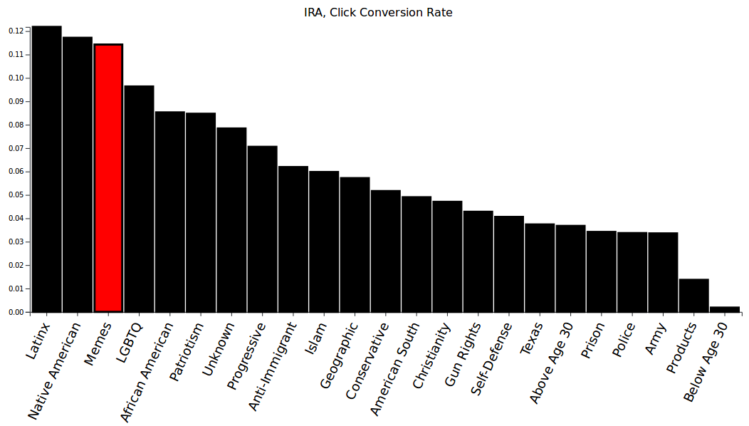
Meme images had an 11.5% conversion rate (the rate at which ad views turned into ad clicks), best for 3rd of all the ad categories I specified.
Most people who spend some time with the Russian Ad Explorer soon stumble upon the IRA's meme posts, which were shown mostly from April to July 2016. Most have almost no political content (at least one exception: link), and some are actually kind of funny (sue me: link). Many people who used the explorer assumed that these memes were honey-traps for pro-Trump pages — that, at some point down the line, Memeopolis would start advocating for Trump. This line of thinking is backed up somewhat by my cost-efficiency statistics, which show that Meme ads were among the fourth most cost-effective ads for viewer clicks.
As I described in the "Data We Don't Have" section, this claim is difficult to immediately verify with this dataset. For example, Memeopolis, the IRA's main meme-sharing page, never released a directly pro-Trump advertisement despite the success of its meme advertisements. If it was re-directing users to pro-Trump pages or viewpoints, it did so via non-advertised posts on the Memeopolis page itself, or otherwise through Facebook comments or other user behaviors. Congress says it will release such data at some point, but until then it is hard to know what to make of Memeopolis.
Vote for Bernie, or Jill Stein
Very memorable.
I have assumed that the IRA worked to get Trump elected, but they also worked at times to get Bernie the primary nomination over Hillary, and in rare instances even suggested voting for Jill Stein. Notably, however, they never put in one positive word for Hillary, despite a wealth of ads aimed at conservatives, except for one time.
Someone at some point, made an ad called "Muslims for Hillary" aimed towards Progressives and "The Muslim Brotherhood", a frequent target audience that I assume was a mistake based in misunderstanding of American culture. One assumes that this ad was meant to scare people who are progressive but fear Muslim people. But what was most notable to me was that despite the wide reporting that one of the IRA's principle goals was to sow chaos, and that this strategy often included appealing to progressive voters, they only once created an ad that said anything positive about Hillary. They had their eye on the prize: getting Donald Trump elected.
Post-Election Goals of the IRA
The IRA continued to function after the election of Trump, which many presumed was their primary goal. So what goals did they chase afterwards? Here's are some of the categories I have noticed:
- A new campaign called "Black Guns Matter"
- New campaigns targeted towards the formerly imprisoned
- A self-defense class marketed towards Black Americans
- Campaigns aimed towards Native Americans began
- Campaigns aimed towards Latinx Americans began
- LGBTQ+ campaigns ended
- Seemingly fewer advertisements for conservatives than before the election
One thing I did notice is that campaigns launched after 2017 seemed to perform better, on average, than campaigns beforehand. For example, as noted in the "Memes" section, campaigns targeted towards Latinx people had the best cost efficiency for ad clicks by a wide margin than all other groups. This is probably due to either Facebook finding better ways to target users with their ads, or to the IRA figuring out how to create clickable advertisements at low cost. Browsing over the "Latinx" targeted ads shows that they lack the long tail of zero-click ads that occupy most other categories — almost every ad hit the mark.
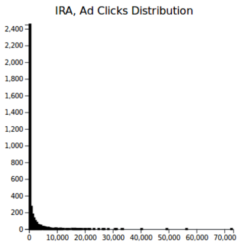
IRA ads have a long tail when it comes to impressions and clicks. Some ad categories, like the 'Latinx' category seemed better able to beat this power law than others.
Self-Defense Classes, and Other Events
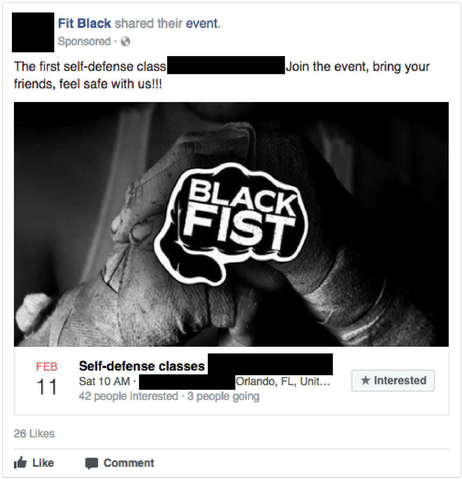
One of the most well-reported aspects of the IRA ads were the ways in which its representative coerced unknowing Americans into holding protests, rallies, and other events for them. Probably one of the most bizarre examples is how a mixed martial arts fighter was paid to host a successful series of self-defense classes for Black Americans, detailed in this article. You can find these ads in the Explorer by clicking the "Self-Defense" tag.
What struck me most about these ads is that in terms of budget, they received much more funding than campaigns that did not lead to real-world actions. This suggests that the IRA was, maybe obviously, willing to throw down more money on events that had an impact outside of social media. Unfortunately, exactly how much takes a bit longer to suss out, as no metadata was included with the ads denoting if they were a "Facebook Event" or not (my broken brain says: maybe a convolutional neural network trained on the images can figure it out..).
Not Just Americans
Target Location: Germany, France, United Kingdom
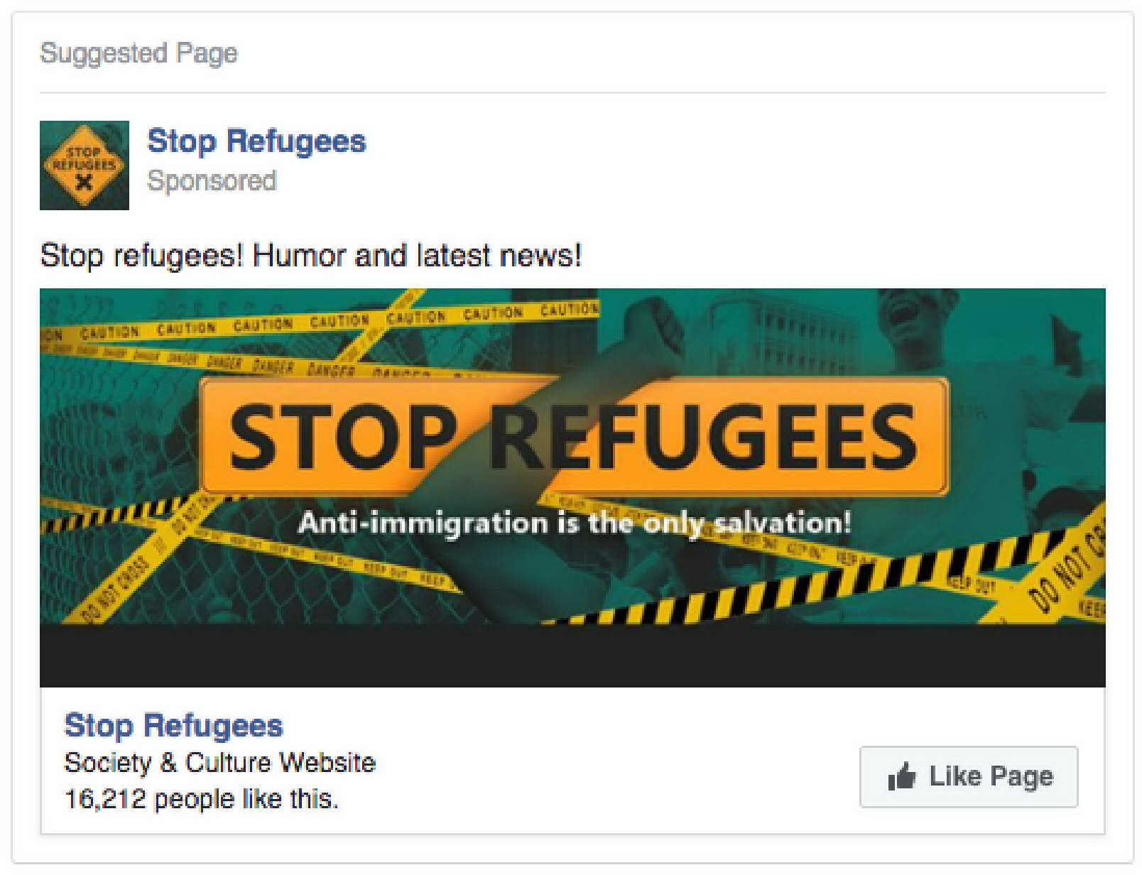
This a relatively minor point, but some ads released in this dataset were not aimed at Americans at all. Specifically, some of the anti-immigration ads (link) were double-shared towards other European countries, probably because of these countries' increasing antipathy towards immigrants.
It is not clear to me from information in the initial release if this ad dataset was supposed to comprise the sum-total efforts of the IRA, or just the American portion. Regardless, it is worth noting regardless that the purpose of the IRA was not only to influence American voters, but also in rare cases people in other countries too.
"Sowing Division"
Many have assumed that the IRA's goals included not only getting Trump elected to the presidency, but also just to generally sow chaos and stoke partisan divisions bewteen liberal and conservative Americans. This is generally the reaction of people I show the explorer to in person: "they're trying to turn us against each other!"
This reaction has bothered me a lot. It has been a common refrain in the past few years, especially by political moderates and conservatives, that one of the prime problems in the past few years has been political polarization as an evil unto itself. Democrats' and Republicans' (and by extension conservatives' and progressives') inability to discuss and compromise on disagreements is sometimes blamed for many of the wildly-unpopular conservative laws and policies that shape daily life in America.
Does turning progressives and conservatives against each other actually work as a strategy to weaken the United States with regards Russia? Personally, I'm skeptical: I think that directly advocating for privatized health insurance, privatized schools, regressive tax systems, prison expansion, racist laws, and environmental deregulation among other things is a much more effective way of crippling the American system. While more information is needed to state it conclusively, I would guess that the IRA understands this too. We'll see soon, either way.
Regardless, one thing I hope everyone takes away from the Explorer and its datasets is that while sowing division was sometimes a goal, the IRA was also motivated by the concrete goal of supporting Donald Trump and conservative policies. Almost no advertisements supported Hillary Clinton; ads were taken out for her Democratic challengers purely in the service of weakening her political bid. Ads that appealed to progressives often honey-pots that redirected to Trump-supporting efforts, or just thinly-veiled Trump supporting pages themselves. The IRA spent, on average, 2.5x times as much on ads I classified as conservative ads, even when they did not perform as well as progressive ads.
What's Next
There is loads more to see in this dataset. Seriously! Play around with the explorer, and send me an email or a tweet if you spot anything interesting.
I started working on some automatic bar chart / scatter plot / histogram visualizations of the data using d3.js, but haven't had much chance to finish it yet. Keep track of my twitter for that — I might post some updates.
Most interesting, perhaps, is a new visualization project using IRA data. Twitter just released a gargantuan dataset of tweets composed by the IRA at this link. There are new challenges with this dataset, both technical and visual. On the technical side, the dataset is too large to be operated on in memory like in the Russian Ad Explorer, so I will likely have to learn new frameworks (React?) to query a database on a server hosted somewhere. Fun, honestly. But the other challenge is how to query and search networked, textual data in a way that makes it easy to extract patterns from data. There are millions of tweets, so how do you find something interesting? Maybe once I am done with grad school applications, we will find out...
Coming soon, more d3.js, whatever project I do.